
What is the Mercator projection? It is a map projection that tries to put the countries from a sphere onto a rectangle.
Almost all world maps you see, and all of the ones we learned about at school, use the Mercator projection. Because of this, we all have a distorted view of how big countries and continents are. For example, on the Mercator projection, Greenland looks to be larger than South America, when, in actual fact, it is only one-eighth the size of South America.
The Mercator projection is a map projection that was made by a Flemish map maker called Gerardus Mercator in 1569. Mercator was born where modern-day Belgium is and he managed to go to university despite coming from a poor family. He studied mathematics, geography, and astronomy. He started to make globes and then ventured out into map making. He entered the map making world at just the time when global exploration was taking off and there was a flourishing trade across the Atlantic Ocean to the New World. There were still many undiscovered places in the world and maps from the 1550s look vastly different to maps of today. There is nothing really in the far east. All of the Indonesian and Filipino islands down to Australia, and Australia itself are not there. The west of North America, the center of the Americas, and large parts of the south of South America are not there. And the continents and countries that are there are very roughly drawn. That makes perfect sense because most of the world had not yet been discovered and there was no real way of making accurate maps.
Trade across the Atlantic was increasing and sailors needed a map to guide them. Many older cultures navigated by the stars and other methods, but sailors in the 16th century needed to be able to head for specific ports. Mercator put his mind to making a map that these sailors could use. He knew that most voyages went from Europe, across the Atlantic to the New World, then either back to Europe or down to Africa, and then back to Europe (something that became known as triangular trade). Most voyages didn’t go far north or far south, so Mercator wanted to make a map that would show longitude and latitude and give these sailors a straight route to their destination. The problem is, our world is obviously a sphere and any map has to be a flat, rectangular representation of that. He had to take the spherical Earth, apply it to a cylinder, and then roll it out.
The problem with the Mercator map projection is that it extends the countries that are north and south of the equator. The countries along the equator and to either side of it don’t change because that is the middle point of the globe. However, as you go further north and south the countries become distorted. The reason for this is because on the real Earth, all of the lines of longitude go from the south pole, through the equator and on to the north pole. At the equator the lines of longitude are the furthest apart and as we get closer to the poles the gap narrows until all of the lines meet at the pole. This is, of course, because the Earth is a sphere. When Mercator opened up that sphere to put it on a flat piece of paper, he made all of the lines of longitude parallel. That was fine at the equator because there was no change but as the map gets closer to the poles the gap on the map between the lines of longitude becomes much larger then the gap on the real Earth, which stretches the countries that these lines pass through. The biggest difference is close to the poles because a gap of almost zero degrees becomes the same as the gap at the equator.
The Mercator projection has been criticized because it misrepresents the size of countries, and there have been calls to take it out of schools. However, the fault is not Mercator’s because the map serves the purposes that he made it for. It is a very effective map for navigating between Africa, Europe, up to half way down South America, and up to half way up North America. Mercator didn’t know that the map would go on to be used in schools. If he had known that, would he have made his map differently? Who knows. Many people have tried to project a spherical Earth accurately onto a flat map, but it is impossible to do completely accurately. No matter what you do, you need to leave bits out or alter something. Imaging taking the peel off an orange and then trying to lay it out into a perfect rectangle. That is the problem map makers face. Modern technology helps because apps like Google maps don’t have the represent the world in flat form. They can give you a globe that you can move in and out of. And this is what I learned today.
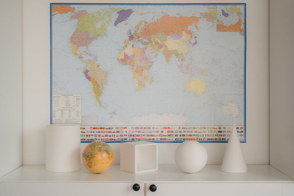
Photo by Marina Leonova: https://www.pexels.com/photo/a-world-map-and-a-globe-in-a-shelf-7634300/
Sources
https://pro.arcgis.com/en/pro-app/latest/help/mapping/properties/mercator.htm
https://en.wikipedia.org/wiki/Mercator_projection
https://education.nationalgeographic.org/resource/gerardus-mercator
https://en.wikipedia.org/wiki/Map_projection
https://www.ck12.org/book/ck-12-earth-science-for-high-school/section/2.3